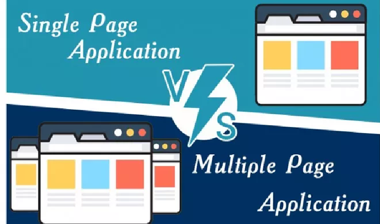
Perks and Pitfalls of Having a One Page Website
Being in the flow of modernization, website design industry seems to adopt many new trends and innovations. The industry is making its efforts in producing appealing sites with better customer engagements and for greater brand awareness. In the mid of 2017, the technique of making a single paged website sprawled to the surface and many marketers blindly begin to practice it. No one was sure as to why be it beneficial to create such a site until statistic hit the market showing some prominent benefits of the site. Therefore, for those who are still oblivion to all the perks of having a one-page website, let’s get down to the list of pros and cons summarized:
Advantages
· Sketches a Compelling Customer’s Journey
A single pages website helps to sketch robust and appealing customer’s journey. In individual section, it steps by step guides and educates the readers. Though a series of facts, figures, strategies and supportive images a target audience is educated and he eventually become ready to make the favorable decision.
Unlike other sites, a visitor is more likely to get distracted or find navigating through the many pages tedious.
· Easy To Comprehend
If you navigate to an average site, you will get surrounded by banners, taglines, chunks of precise information and options to visit inner pages along with CTA’s that claims to solve your problems. Though these sites generate conversion they are emotionally disconnected from the reader. On the contrary, the single page sites, act as a teacher. It takes a visitor through a detailed and comprehensive journey where every option show its own worth, even if a CTA appears it too has a purpose to serve at that [particular space. These sites build an emotional connection with the visitor and gradually converts him or her into a prospective customer.
· Mobile Responsive
The only most important reason for such sites to launch was that they were mobile responsive. One-page sites were mobile friendly. They are easy to use and convenient to scroll. They do not have inner pages to scroll into through the tiny screens of your smartphones (of course, not everybody can afford a galaxy note 3). So yes, life becomes easier as the experts belonging to the website design company started launching their one-page sites.
Disadvantages
· A Lot of Scrolling
One page website requires scrolling and a lot of scrolling bothers many customers. Even while using a hand-held device or a smartphone, they feel disconnected through the entire journey the site has created in the beginning. Prolonged scrolling breeds frustration and increases bounce rates.
· Longer Load Time
Marketers thought that by having a single page site it will take less time to load the site. However, that is not what it turned out to be. A single page site has banners, heavy images, high definition graphics, colors (bold normally as they are in trend) and many other features that make a page becomes overloaded and thus influenced its speed ad time of loading.

